Cells in ReoGrid can hold cell body, cell body is an interface that shows customized content in cell, interacts with user input. Customized cell body class must inherited from CellBody or implemented from ICellBody interface. For more about cell body, see Custom Cell.
The following built-in types of cell body are available:
| Class Name | Sample | Description |
|---|---|---|
| ButtonCell |  | General button. |
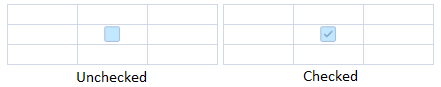
| CheckBoxCell |   | Check box that toggles the cell data between .NET Boolean value true and false. |
| RadioButtonCell |   | Radio button that toggles the cell data between true and false, radio buttons in same group can toggle each other. |
| HyperlinkCell |  | Hyperlink that can navigate to specified URL automatically. |
| DropDownListCell |  | Drop-down cell that provides a candidates list and makes user choose a single item as cell data. |
| ProgressCell |  | Progress cell that displays a progress bar in cell according to the cell data 0~1. |
| NegativeProgressCell |   | Negative progress cell that can display positive and negative progress bar according to the cell data 0~1. |
| Image |  | Image cell that displays an image in cell. |
| ImageButton |  | Image button that displays an image on button in cell. |
| DatePickerCell | 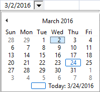 | Date picker cell that allow user choose date from a drop-down calendar. |
| NumberInputCell | Numeric input cell with spin buttons to increment or decrement the value. | |
| ComboListCell | Combo box style cell that combines a text input with a drop-down selection list. | |
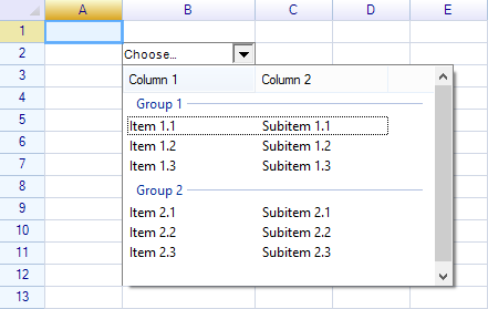
| ColumnDropdownListCell | Drop-down list cell that uses column data as the selection source. |
To use built-in cell types, the below namespace is necessary.
using unvell.ReoGrid.CellTypes;
Button
Class ButtonCell represents a button control on worksheet.
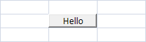
sheet[1,2] = new ButtonCell("Hello");
Cell body always uses cell's data as its label, following code also works:
sheet[1,2] = new ButtonCell();
sheet[1,2] = "Hello";
Button Click Event
The event Click will be raised when user clicked on the button.
var button = new ButtonCell("Hello");
button.Click += (s, e) => MessageBox.Show("Button clicked");
Perform Click
It is possible to use method PerformClick to simulate a click event, for example:
button.PerformClick();
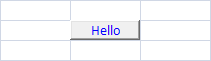
Change Button Text Color
By changing the cell style it is possible to change the color of button label, for example, the following code changes button label to blue.
var cell = sheet.Cells["C3"];
cell.Style.TextColor = Color.Blue;

var button = new ButtonCell("Hello");
cell.Body = button;
Hyperlink
Hyperlink uses cell's data as its navigate URL.

sheet[1,2] = new HyperlinkCell("http://www.google.com");

// or

sheet[1,2] = new HyperlinkCell();
sheet[1,2] = "http://www.google.com";
Automatic Navigation
The second argument autoNavigate of the constructor specifies that whether or not navigate to the specified URL when user clicked on this hyperlink. For exmaple:
sheet[1,2] = new HyperlinkCell("http://www.google.com/", true);
Hyperlink Click Event
The event Click raised when user clicked on this hyperlink.
Before this event being raised, the URL may performed firstly if the autoNavigate argument is true. To avoid this, set autoNavigate to false.
var link = new HyperlinkCell("http://myurl.com", false);
link.Click += (s, e) => { doMyEventHandler(); };
Perform Click
It is possible to use method PerformClick to simulate a click event, for example:
link.PerformClick();
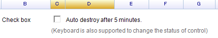
Check Box
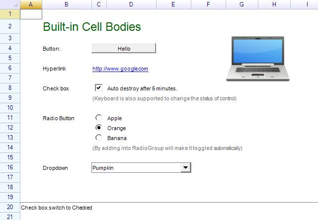
CheckBoxCell class represents a check box on worksheet, but it doesn't provide the label to be displayed on worksheet. Usually it is necessary to put the label before or after the check box cell, like the following image:
var checkboxCell = new CheckBoxCell();

// add check box and a text label
sheet["C1"] = new object[] { checkboxCell, "Auto destroy after 5 minutes." };
Get and Set Check Status
Directly set the cell's data using boolean value to check and uncheck the check box, or using the property IsChecked to get the check status.
// check
sheet[1, 2] = true;

// uncheck
sheet[1, 2] = false;

// get check status from worksheet
bool isChecked = (sheet["C1"] as bool?) ?? false;

// get or set check status from check box
bool isChecked = checkboxCell.IsChecked;
Click and CheckChanged event
Click event raised when user clicked on check box. Click event don't fire when user pressed Space key inside cell.
checkboxCell.Click += (s, e) => { doEventHandler(); };
CheckChanged event raised when user changed the check-box status by mouse or keyboard.
checkboxCell.CheckChanged += (s, e) => { doEventHandler(); };
CellDataChanged event
Since check box cell updates cell's data as bool value. When the check-box status changed, CellDataChanged event will also be raised.
sheet.CellDataChanged += (s, e) =>
{
  if (e.Cell.Position == new CellPosition("C1"))
  {
    MessageBox.Show("Check box status changed: " + e.Cell.Data);
  }
};
Custom Drawing for Check box
To customize the appearance instead of the built-in one for check box cell, override the OnContentPaint method, the following code draws the check box using checked and unchecked images.
class MyCheckBox : CheckBoxCell {
  Image checkedImage, uncheckedImage;

  public MyCheckBox() {
    checkedImage = Image.FromFile(@"...");
    uncheckedImage = Image.FromFile(@"...");
  }

  protected override void OnContentPaint(CellDrawingContext dc) {
    if (this.IsChecked) {
      dc.Graphics.DrawImage(checkedImage, this.ContentBounds);
    } else {
      dc.Graphics.DrawImage(uncheckedImage, this.ContentBounds);
    }
  }
}
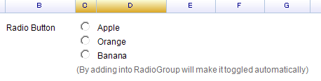
Radio
Class RadioButtonCell represents radio button on worksheet, it inherits from CheckBoxCell class, so that the usage of radio button cell almost same as the check box.
To add a radio button, use following code:
var radio = new RadioButtonCell();
sheet["C3"] = radio;
Radio Group
RadioButtonCell added into RadioGroup or specified by using its RadioGroup property will make radio buttons in the same group toggle each other automatically.
var radioGroup = new RadioButtonGroup();
sheet[10, 2] = new object[,] {
  {new RadioButtonCell() { RadioGroup = radioGroup }, "Apple"},
  {new RadioButtonCell() { RadioGroup = radioGroup }, "Orange"},
  {new RadioButtonCell() { RadioGroup = radioGroup }, "Banana"}
};
Click and CheckChanged event
To handle Click event:
radio.Click += (s, e) => doEventHandler();
To handle CheckChanged event for all radio buttons in a group:
radioGroup.RadioButtons.ForEach(rb => rb.CheckChanged += (s, e) =>
  ShowText(sheet, "Radio button selected: " + sheet[rb.Cell.Row, rb.Cell.Column + 1]));
CellDataChanged event
Since radio button cell updates cell's data as bool value. When the radio button status changed, CellDataChanged event will also be raised. See Check Box Cell above for sample code.
Drop-down List
Drop-down list cell represented by class DropdownListCell.
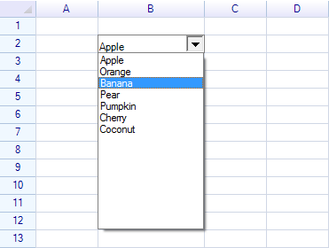
Code to add a drop-down list cell on worksheet:
var dropdown = new DropdownListCell(
  "Apple", "Orange", "Banana", "Pear",
  "Pumpkin", "Cherry", "Coconut"
);
sheet["B2"] = dropdown;
Event of drop-down list cell
The event SelectedItemChanged of drop-down list cell used to get selected item from drop-down panel.
dropdown.SelectedItemChanged += (s, e) => { ... };
Same as check box cell, drop-down list cell also updates data of cell, it is possible to get selected item by handling CellDataChanged event:
sheet.CellDataChanged += (s, e) => { ... };
Learn more details about Drop-down list cell.
Custom Drop-down
The drop-down cell could be customize, it is possible to put Windows Form-compatible controls into the drop-down panel.
See how to create custom drop-down cell.
Image
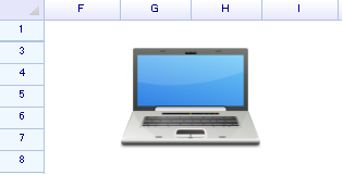
Code to add image cell:
var image = Image.FromFile("...");
sheet[2, 6] = new ImageCell(image);
View Mode of Image Cell
ImageCell has property named ViewMode which is used to decided how to show the image inside a cell:
// create ImageCell by specifying the view-mode
var imgCell = new ImageCell(img, ImageCellViewMode.Zoom);
sheet["F6"] = imgCell;

// or change the property directly
imgCell.ViewMode = ImageCellViewMode.Clip;
Alignments
Horizontal and vertical alignment style of cell can be used to decide where to show the image:
var cell = sheet.Cells["F6"];
cell.Style.HAlign = ReoGridHorAlign.Center;
cell.Style.VAlign = ReoGridVerAlign.Middle;
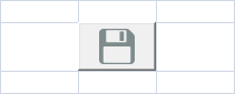
Image Button Cell
Code to create an image button at cell C3:
sheet["C3"] = new ImageButtonCell(Image.FromFile(@"C:\\PathToFile\\Save-32.png"));
Result:
Date Picker
A built-in Date Picker Cell.
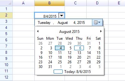
To create an own date picker cell using free-edition ReoGrid, see how to create date picker cell.
Adjusting size for cell body
The size of cell body is decided by its parent cell with a padding style value, it is also possible to make cell larger by merging multiple cells.
Windows Form and WPF edition
ReoGrid supports a part of cell types in WPF edition as the following.
| Built-in Cell Body Type | Windows Form | WPF |
|---|---|---|
| Button | Yes | Yes |
| Check Box | Yes | Yes |
| Radio Button | Yes | Yes |
| Hyperlink | Yes | Yes |
| Image Cell | Yes | Yes |
| Image Button Cell | Yes | Yes |
| Progress Bar Cell | Yes | Yes |
| Negative Progress Bar Cell | Yes | Yes |
| Drop-down Cell | Yes | Not implemented |
| Drop-down List Cell | Yes | Not implemented |
| NumberInputCell | Yes | Not implemented |
| ComboListCell | Yes | Not implemented |
| ColumnDropdownListCell | Yes | Not implemented |
| Custom Cell Body | Yes | Yes |
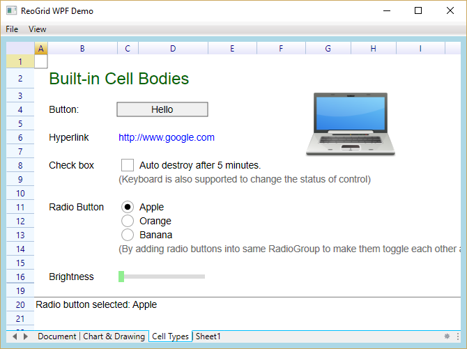
Learn more from Demo project
The built-in cell types examples in Demo project.
Windows From edition
WPF edition