ReoGrid Spreadsheet Component
FastandPowerfulvisual spreadsheet component for .NET applications
4.92 of 5 CodeProject
1.1k Stars
GitHub
Over 100k
Downloads
NEW
NEW VERSION NOW AVAILABLE
More powerful and faster
ReoGrid is a .NET spreadsheet component equipped with the features and functionalities of the spreadsheet software "Excel".
The new version, which has added many new features, achieves even greater speed improvements.
The much-requested WPF version has also been revamped, further enhancing its completeness.
Powerful Features
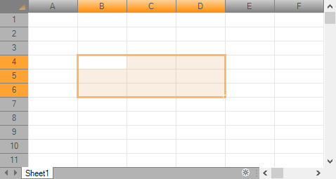
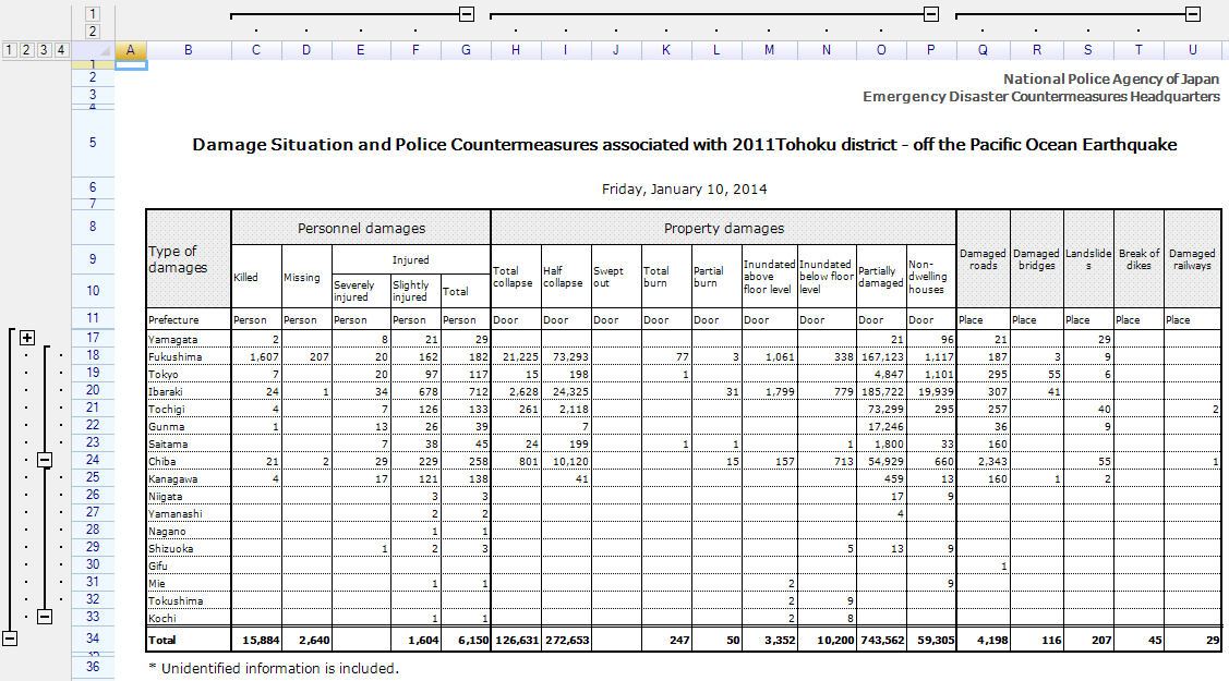
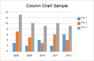
ReoGrid supports functions such as cell formatting, borders, data filters, cell freezing, and formula calculations, similar to Excel. You can incorporate Excel-like functionalities into your application in an instant.
High Performance
It operates with high performance that can support large-scale financial and business systems, enabling a stress-free UI interface for users.
Technical Support
The paid version comes with 1 to 3 months of free technical support, allowing for a smooth and secure implementation into your project.
High Reliability
Since its debut in 2014, ReoGrid has been adopted in numerous projects around the world, including in Japan, the United States, and Germany. It has a track record of being implemented in projects where reliability is crucial, such as financial systems.
Powerful and Extensive Features
Equipped with powerful and extensive features, it supports all kinds of applications.
POWERFUL FEATURES
POWERFUL SUPPORT
If you are having trouble implementing ReoGrid, using the paid "Implementation Support Service" allows for ReoGrid to be modified and tailored according to your needs. Many companies have utilized the paid "Implementation Support Service" to customize ReoGrid and have successfully integrated it into their products.
Getting Started with ReoGrid
ReoGrid can be installed from NuGet. Search for ReoGrid on NuGet or install the package using the following command.
Installation
For Windows Forms applications:
>
For WPF applications:
>
Alternatively, you can download the package from the download page.
Preparing a worksheet
By Programming:
By Loading an Excel template: