
There are six built-in cell types.
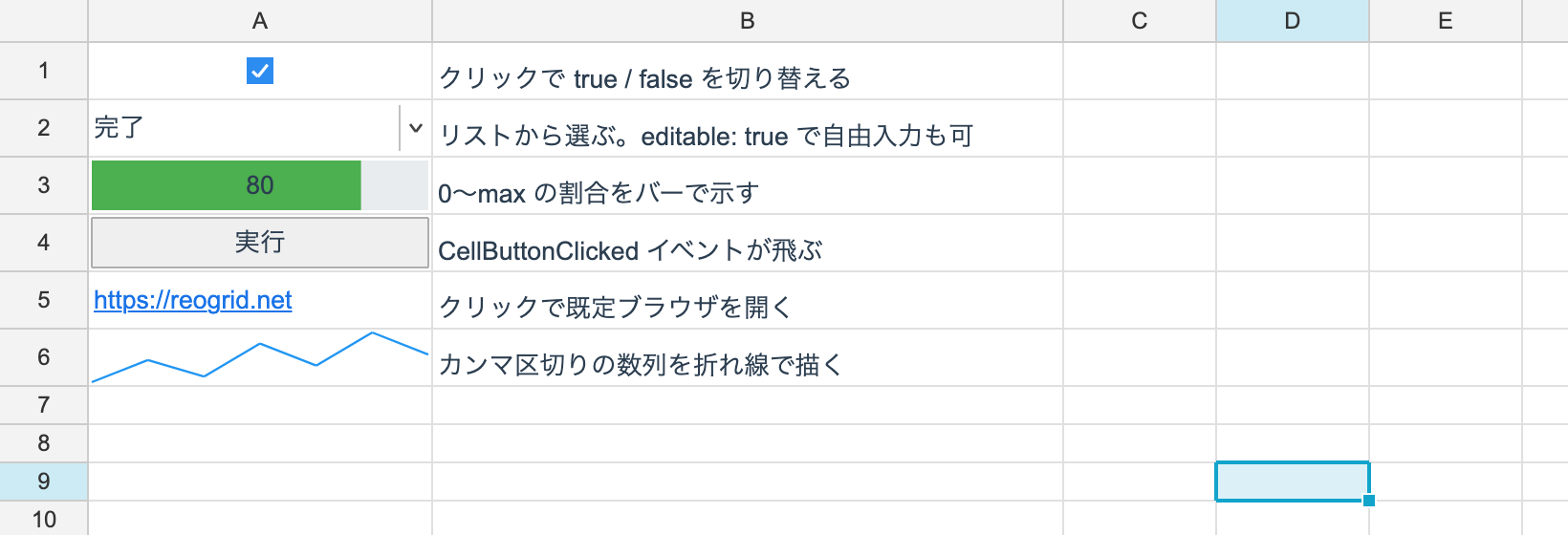
ws.SetCellType(0, 0, CheckboxCellType.Instance);
ws.SetCellType(1, 0, new DropdownCellType(["Not started", "In progress", "Done"], editable: false));
ws.SetCellType(2, 0, new ProgressCellType(max: 100, color: 0xFF4CAF50));
ws.SetCellType(3, 0, new ButtonCellType("Run"));
ws.SetCellType(4, 0, HyperlinkCellType.Instance);
ws.SetCellType(5, 0, new SparklineCellType(color: 0xFF2196F3));
The list
| Type | Created with | Cell value it uses |
|---|---|---|
| Checkbox | CheckboxCellType.Instance | bool |
| Dropdown | new DropdownCellType(options, editable) | string (the selection) |
| Progress bar | new ProgressCellType(max, color, bidirectional, showText) | double |
| Button | new ButtonCellType(text) | text (the label, when text is omitted) |
| Hyperlink | HyperlinkCellType.Instance | string (the URL) |
| Sparkline | new SparklineCellType(color) | string (comma-separated numbers) |
CheckboxCellType and HyperlinkCellType carry no settings, so they share a single
Instance.
Checkbox
The value is a bool. Clicking toggles it.
ws.SetCellType(0, 0, CheckboxCellType.Instance);
ws.SetBoolean(0, 0, true);
A formula can count them: COUNTIF(A:A, TRUE).
Dropdown
new DropdownCellType(["Not started", "In progress", "Done"], editable: false)With editable: true, text outside the option list can be typed in directly (Excel’s “list”
validation with “allow other values”).
A click makes the control show a popup. Headless, the descriptor merely returns
OpenDropdown and no popup happens.
Progress bar
new ProgressCellType(max: 100, color: 0xFF4CAF50, bidirectional: false, showText: true)| Argument | What it does |
|---|---|
max | The value corresponding to 100% (default 100) |
color | The bar color (ARGB) |
bidirectional | Draw negative values leftwards |
showText | Show the number over the bar |
Button
new ButtonCellType("Run")Omit text and the cell value becomes the label. Handle the click with the control’s
CellButtonClicked event.
control.CellButtonClicked += (s, e) => { /* e carries the position */ };Hyperlink
ws.SetCellType(0, 0, HyperlinkCellType.Instance);
ws.SetText(0, 0, "https://reogrid.net");
Clicking opens the default browser. Opening it is the control layer’s job, so nothing happens headless.
Sparkline
ws.SetCellType(0, 5, new SparklineCellType());
ws.SetText(0, 5, "3,7,4,9,12,8,15");     // comma-separated numbers
Draws a line chart inside the cell. It is new in V5; V4 had no equivalent.
Types V4 had that V5 does not
DatePicker, RadioButton, NumberInput and the image types are not implemented. When you
need one, write it as a custom cell type — there is a worked
example in Building a Date-picker Cell.
Persistence
Cell types round-trip through reogrid-json scoped to a range ({r, c, rs, cs, config}).
XLSX has no equivalent concept, so exporting turns them back into ordinary cells.