Cells in ReoGrid can host a cell body — a component that renders custom content and handles user interaction. ReoGrid provides many built-in cell body types for common UI controls.
Namespace
using unvell.ReoGrid.CellTypes;Available Cell Types
| Class | Sample | Description |
|---|---|---|
ButtonCell |  | General button |
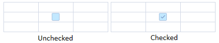
CheckBoxCell |  | Check box (toggles true/false) |
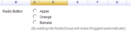
RadioButtonCell |  | Radio button (mutual exclusion within a group) |
HyperlinkCell |  | Hyperlink with optional auto-navigation |
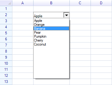
DropdownListCell |  | Drop-down list for single item selection |
ComboListCell | Combo box with text input and drop-down selection | |
ProgressCell |  | Progress bar (value 0–1) |
NegativeProgressCell |  | Positive/negative progress bar |
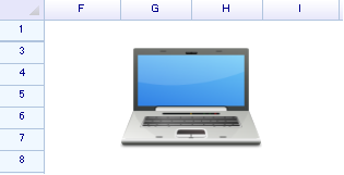
ImageCell |  | Displays an image |
ImageButtonCell |  | Image on a button |
DatePickerCell | 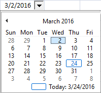 | Date picker with calendar drop-down |
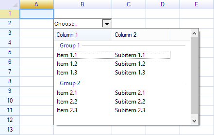
ColumnDropdownListCell | Drop-down list using column data as source |
Setting a Cell Body
// Via worksheet indexer
sheet[1, 2] = new ButtonCell("Click Me");

// Via cell instance
var cell = sheet.Cells["C3"];
cell.Body = new CheckBoxCell();
ICellBody Interface
All cell bodies implement ICellBody. The CellBody base class provides default implementations:
| Member | Description |
|---|---|
OnSetup(Cell cell) | Called when the body is attached to a cell |
OnPaint(CellDrawingContext dc) | Render the cell body |
OnMouseDown/Up/Move/Enter/Leave | Mouse interaction handlers (return true to consume the event) |
OnMouseWheel(e) | Mouse wheel handler |
OnKeyDown/Up(KeyCode) | Keyboard handlers (return true to consume) |
OnStartEdit() | Called when the cell enters edit mode (return false to prevent) |
OnEndEdit(data, reason) | Called when edit ends (return modified data or original) |
OnSetData(data) | Called when cell data is set (return modified data or original) |
OnGotFocus() / OnLostFocus() | Focus change handlers |
AutoCaptureMouse() | Whether to capture mouse events (default: true) |
DisableWhenCellReadonly | Whether the body is disabled when the cell is read-only (default: true) |
Cell | The parent cell (read-only, available after OnSetup) |
Clone() | Create a copy of the cell body |
For creating custom cell bodies, see Custom Cell.
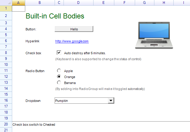
ButtonCell
A clickable button that displays the cell’s data as its label.
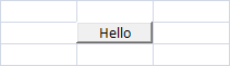
// With default text
sheet[1, 2] = new ButtonCell("Hello");

// Without text — uses cell data as label
sheet[1, 2] = new ButtonCell();
sheet[1, 2] = "Hello";
Properties
| Property | Type | Description |
|---|---|---|
IsPressed | bool | Whether the button is currently pressed |
Events
| Event | Description |
|---|---|
Click | Raised when the user clicks the button |
Methods
| Method | Description |
|---|---|
PerformClick() | Simulate a button click programmatically |
var button = new ButtonCell("Hello");
button.Click += (s, e) => MessageBox.Show("Button clicked");
sheet["C3"] = button;

// Programmatic click
button.PerformClick();
Customize Button Appearance
Change the button label color through the cell style:
var cell = sheet.Cells["C3"];
cell.Style.TextColor = Color.Blue;
cell.Body = new ButtonCell("Hello");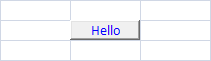
CheckBoxCell
A check box that toggles the cell’s data between true and false.
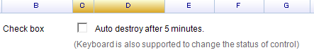
var checkbox = new CheckBoxCell();
sheet["C1"] = new object[] { checkbox, "Auto destroy after 5 minutes." };
Constructors
| Constructor | Description |
|---|---|
CheckBoxCell() | Creates an unchecked checkbox |
CheckBoxCell(bool initChecked) | Creates a checkbox with initial check state |
Properties
| Property | Type | Description |
|---|---|---|
IsChecked | bool | Get or set the check state |
Get and Set Check State
// Set via cell data
sheet[1, 2] = true;   // check
sheet[1, 2] = false;  // uncheck

// Get via cell data
bool isChecked = (sheet["C1"] as bool?) ?? false;

// Get/set via checkbox instance
checkbox.IsChecked = true;
bool state = checkbox.IsChecked;
Events
| Event | Description |
|---|---|
Click | Raised when the user clicks the checkbox (not on Space key) |
CheckChanged | Raised when the check state changes (by mouse or keyboard) |
checkbox.Click += (s, e) => { /* handle click */ };

checkbox.CheckChanged += (s, e) =>
{
    Console.WriteLine($"Checked: {checkbox.IsChecked}");
};
Since the checkbox updates cell data, CellDataChanged also fires:
sheet.CellDataChanged += (s, e) =>
{
    if (e.Cell.Position == new CellPosition("C1"))
        Console.WriteLine("Checkbox changed: " + e.Cell.Data);
};
Custom Drawing
Override OnContentPaint to customize checkbox appearance:
class MyCheckBox : CheckBoxCell
{
    Image checkedImage, uncheckedImage;

    public MyCheckBox()
    {
        checkedImage = Image.FromFile(@"...");
        uncheckedImage = Image.FromFile(@"...");
    }

    protected override void OnContentPaint(CellDrawingContext dc)
    {
        dc.Graphics.DrawImage(
            this.IsChecked ? checkedImage : uncheckedImage,
            this.ContentBounds);
    }
}
RadioButtonCell
A radio button that inherits from CheckBoxCell. Radio buttons within the same group toggle each other.
var radio = new RadioButtonCell();
sheet["C3"] = radio;
RadioButtonGroup
Assign a shared RadioButtonGroup so only one radio button can be selected at a time:
var group = new RadioButtonGroup();

sheet[10, 2] = new object[,] {
    { new RadioButtonCell() { RadioGroup = group }, "Apple" },
    { new RadioButtonCell() { RadioGroup = group }, "Orange" },
    { new RadioButtonCell() { RadioGroup = group }, "Banana" },
};
RadioButtonGroup Members
| Member | Type | Description |
|---|---|---|
RadioButtons | List<RadioButtonCell> | All radio buttons in this group |
AddRadioButton(cell) | Method | Manually add a radio button to the group |
Contains(cell) | Method | Check if a radio button belongs to this group |
Properties
| Property | Type | Description |
|---|---|---|
RadioGroup | RadioButtonGroup | The group this radio button belongs to |
IsChecked | bool | Get or set the selection state (inherited) |
Events
// Click event
radio.Click += (s, e) => { /* handle */ };

// CheckChanged on all radios in a group
group.RadioButtons.ForEach(rb =>
    rb.CheckChanged += (s, e) =>
        Console.WriteLine("Selected: " + sheet[rb.Cell.Row, rb.Cell.Column + 1]));
DropdownListCell
A drop-down list that lets the user choose from a list of items.
Constructors
| Constructor | Description |
|---|---|
DropdownListCell() | Empty drop-down list |
DropdownListCell(params string[] candidates) | Drop-down with string items |
DropdownListCell(IEnumerable<string> candidates) | Drop-down with a collection of strings |
DropdownListCell(ReferenceRange refRange) | Drop-down using a cell range as the data source |
var dropdown = new DropdownListCell(
    "Apple", "Orange", "Banana", "Pear",
    "Pumpkin", "Cherry", "Coconut"
);
sheet["B2"] = dropdown;
Properties
| Property | Type | Description |
|---|---|---|
SelectedItem | object | The currently selected item |
SelectedIndex | int | Index of the selected item |
Events
| Event | Description |
|---|---|
SelectedItemChanged | Raised when the selected item changes |
dropdown.SelectedItemChanged += (s, e) =>
{
    Console.WriteLine("Selected: " + dropdown.SelectedItem);
};
The selected item is also set as cell data, so CellDataChanged fires too.
Learn more at Drop-down List Cell.
ComboListCell
A combo box that combines a text input field with a drop-down selection list. Supports auto-completion while typing.
Constructors
| Constructor | Description |
|---|---|
ComboListCell() | Empty combo list |
ComboListCell(params string[] candidates) | With string items |
ComboListCell(IEnumerable<string> candidates) | With a collection of strings |
ComboListCell(ReferenceRange refRange) | Using a cell range as the data source |
var combo = new ComboListCell("Apple", "Orange", "Banana");
sheet["B2"] = combo;
Properties
| Property | Type | Description |
|---|---|---|
SelectedItem | object | The currently selected item |
SelectedIndex | int | Index of the selected item |
EnableAutoCompletion | bool | Enable auto-completion while typing (default: true) |
AutoCompleteComparerator | Func<string, string, bool> | Custom comparison function for auto-completion |
CandidationListSearchProvider | Func<object, IList<string>> | Custom search provider for the candidate list |
Events
| Event | Description |
|---|---|
SelectedItemChanged | Raised when the selected item changes |
DropdownCell (Base Class)
DropdownCell is the abstract base class for all drop-down cell types. It can be extended to create custom drop-down controls.
Properties
| Property | Type | Default | Description |
|---|---|---|---|
PullDownOnClick | bool | false | Open the drop-down panel on cell click |
DropdownButtonSize | RGSize | 16x16 | Size of the drop-down button |
DropdownButtonAutoHeight | bool | true | Auto-adjust button height to match cell |
IsDropdown | bool | false | Whether the drop-down panel is currently open |
DropdownPanelHeight | int | 200 | Height of the drop-down panel |
MinimumDropdownWidth | int | 40 | Minimum width of the drop-down panel |
MaximumDropdownWidth | int | 1200 | Maximum width of the drop-down panel |
DropdownControl | Control | null | The control displayed in the drop-down panel |
DropdownButtonStyle | DropdownCellStyle | — | Style of the drop-down button |
Methods
| Method | Description |
|---|---|
PushDown(bool forceCellEdit = true) | Open the drop-down panel |
PullUp() | Close the drop-down panel |
Events
| Event | Description |
|---|---|
DropdownOpened | Raised when the drop-down panel opens |
DropdownClosed | Raised when the drop-down panel closes |
See How to Create a Custom Drop-down Cell for creating custom drop-down controls.
ProgressCell
Displays a horizontal progress bar. The cell value (0–1) determines the fill amount.
sheet["B2"] = new ProgressCell();
sheet["B2"] = 0.7;  // 70% progress
Properties
| Property | Type | Default | Description |
|---|---|---|---|
TopColor | SolidColor | LightSkyBlue | Top gradient color of the progress bar |
BottomColor | SolidColor | SkyBlue | Bottom gradient color of the progress bar |
var progress = new ProgressCell
{
    TopColor = SolidColor.LightGreen,
    BottomColor = SolidColor.Green,
};
sheet["B2"] = progress;
sheet["B2"] = 0.5;
NegativeProgressCell
Displays progress bars for both positive and negative values. Positive values extend right from center; negative values extend left.
sheet["B2"] = new NegativeProgressCell();
sheet["B2"] = -0.3;  // 30% negative progress
Properties
| Property | Type | Default | Description |
|---|---|---|---|
PositiveColor | SolidColor | LightGreen | Color for positive values |
NegativeColor | SolidColor | LightCoral | Color for negative values |
LinearGradient | bool | true | Apply gradient shading |
DisplayCellText | bool | true | Show the cell text value |
LimitedInsideCell | bool | true | Limit the bar to cell boundaries |
HyperlinkCell
A clickable hyperlink. Uses the cell data as the display text and navigation URL.

// Auto-navigate to URL on click
sheet[1, 2] = new HyperlinkCell("http://www.google.com", true);

// Or set URL and display text separately
sheet[1, 2] = new HyperlinkCell("http://www.google.com", false);
sheet[1, 2] = "Google";
Constructors
| Constructor | Description |
|---|---|
HyperlinkCell() | Hyperlink with auto-navigation enabled |
HyperlinkCell(string url) | Hyperlink with URL and auto-navigation enabled |
HyperlinkCell(string url, bool autoNavigate) | Hyperlink with configurable auto-navigation |
Properties
| Property | Type | Default | Description |
|---|---|---|---|
LinkURL | string | null | The navigation URL |
AutoNavigate | bool | true | Automatically navigate when clicked |
LinkColor | SolidColor | Blue | Color of unvisited links |
VisitedColor | SolidColor | Purple | Color of visited links |
ActivateColor | SolidColor | Red | Color when the link is pressed |
Events
| Event | Description |
|---|---|
Click | Raised when the link is clicked (after navigation if AutoNavigate is true) |
var link = new HyperlinkCell("http://myurl.com", false);
link.Click += (s, e) => { /* custom handler */ };
sheet["A1"] = link;
Methods
| Method | Description |
|---|---|
PerformClick() | Simulate a click programmatically |
ImageCell
Displays an image inside a cell.
var image = Image.FromFile("photo.jpg");
sheet[2, 6] = new ImageCell(image);
Constructors
| Constructor | Description |
|---|---|
ImageCell() | Empty image cell |
ImageCell(Image image) | Image cell with the specified image |
ImageCell(Image image, ImageCellViewMode viewMode) | Image cell with view mode |
Properties
| Property | Type | Description |
|---|---|---|
Image | Image | The image to display |
ViewMode | ImageCellViewMode | How the image is displayed |
ImageCellViewMode Enum
| Value | Description |
|---|---|
Stretch | Fill to cell boundary (default) — may distort the image |
Zoom | Scale proportionally to fit within cell boundary |
Clip | Keep original size and clip to cell boundary |
var imgCell = new ImageCell(img, ImageCellViewMode.Zoom);
sheet["F6"] = imgCell;
Control image position with cell alignment styles:
var cell = sheet.Cells["F6"];
cell.Style.HAlign = ReoGridHorAlign.Center;
cell.Style.VAlign = ReoGridVerAlign.Middle;
ImageButtonCell
A button that displays an image. Inherits from ButtonCell.
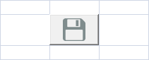
sheet["C3"] = new ImageButtonCell(Image.FromFile("Save-32.png"));Properties
| Property | Type | Description |
|---|---|---|
Image | Image | The image to display on the button |
Inherits Click event and PerformClick() method from ButtonCell.
DatePickerCell
A drop-down cell with a month calendar for date selection. WinForms only.
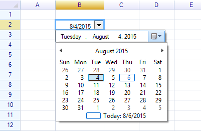
sheet["B2"] = new DatePickerCell();The selected date is stored as the cell’s data.
Note:
DatePickerCellis only available in the WinForms edition. For WPF, see How to Create a Date Picker Cell.
ColumnDropdownListCell
A drop-down list that uses column data as its selection source. WinForms only.
sheet["B2"] = new ColumnDropdownListCell();Cell Body Size
The size of a cell body is determined by its parent cell, including any padding styles. To make a cell body larger, merge multiple cells:
sheet.MergeRange("B2:D4");
sheet["B2"] = new ButtonCell("Large Button");
Platform Availability
| Cell Type | WinForms | WPF |
|---|---|---|
| ButtonCell | Yes | Yes |
| CheckBoxCell | Yes | Yes |
| RadioButtonCell | Yes | Yes |
| HyperlinkCell | Yes | Yes |
| ImageCell | Yes | Yes |
| ImageButtonCell | Yes | Yes |
| ProgressCell | Yes | Yes |
| NegativeProgressCell | Yes | Yes |
| DropdownCell | Yes | Yes |
| DropdownListCell | Yes | Yes |
| ComboListCell | Yes | Yes |
| ColumnDropdownListCell | Yes | No |
| DatePickerCell | Yes | No |
| Custom Cell Body | Yes | Yes |
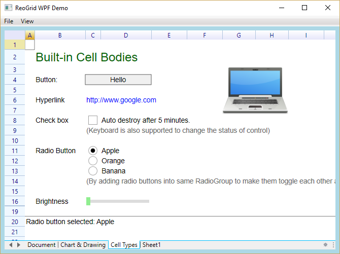
Demo Projects
Examples of built-in cell types are included in the Demo project.
WinForms:
WPF:
Related Topics
- Custom Cell — Creating custom cell bodies
- Drop-down List Cell — Drop-down list details
- How to Create Custom Drop-down Cell — Custom drop-down tutorial
- How to Create Date Picker Cell — WPF date picker tutorial
- Cell — Cell properties and data