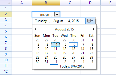
This article shows how to create a custom date picker cell — a cell that allows users to choose a date value from a drop-down calendar component.
Create a custom cell body
ReoGrid allows users to create any custom cell type using the cell body interface. To create a cell body, create a class that inherits from the CellTypes.CellBody class. In this example, we will create a drop-down-enabled cell body, which requires the body to inherit from the CellTypes.DropDownCell class.
public class DatePickerCell : DropdownCell
{
// our class members
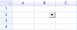
}By adding this custom cell body to the worksheet, an empty drop-down cell will be displayed.
var worksheet = grid.CurrentWorksheet;
worksheet["B2"] = new DatePickerCell();
Result:
Next, we will add a standard .NET date picker control into the empty drop-down panel.
public class DatePickerCell : DropdownCell
{
  private DateTimePicker picker = null;

  public DatePickerCell()
  {
    // create a standard .NET date picker
    picker = new DateTimePicker();

    // handle its event
    picker.ValueChanged += Picker_ValueChanged;

    **// add date picker to drop-down cell panel**
    **base.DropdownControl = picker;**

    base.MinimumDropdownWidth = 220;
    base.DropdownPanelHeight = 24;
  }

  ...
}
We should handle the standard .NET date picker event to receive the value selected by the end user.
private void Picker_ValueChanged(object sender, EventArgs e)
{
  if (this.Cell != null) this.Cell.Data = picker.Value;
}
Additionally, when the cell body is first assigned to a cell, the OnSetup method will be invoked. Here, we set some styles for that cell.
public override void OnSetup(ReoGridCell cell)
{
  // call default OnSetup behavior
  base.OnSetup(cell);

  // give cell a small indent, since the space on the right side is already taken by the drop-down button
  cell.Style.Indent = 3;

  // Important! Set the cell date format to display dates correctly
  cell.DataFormat = DataFormat.CellDataFormatFlag.DateTime;
}
Result: