The Pie2DChart displays data as proportional slices of a circle, useful for showing parts of a whole.
Example
Prepare Data
var sheet = grid.CurrentWorksheet;
sheet["A2"] = new object[,] {
{ null, 2008, 2009, 2010, 2011, 2012 },
{ "City 1", 3, 2, 4, 2, 6 },
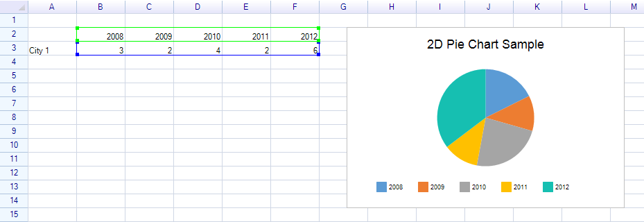
};Define Ranges and Create Chart
For pie charts, use a single row of data. Pass RangePosition.Empty for the serial names range when there is only one series:
var dataRange = sheet.Ranges["B3:F3"];
var categoryNamesRange = sheet.Ranges["B2:F2"];

sheet.AddHighlightRange(dataRange);
sheet.AddHighlightRange(categoryNamesRange);

var chart = new Chart.Pie2DChart
{
    Location = new Graphics.Point(220, 160),
    Size = new Graphics.Size(400, 260),
    Title = "2D Pie Chart Sample",
    DataSource = new WorksheetChartDataSource(sheet, RangePosition.Empty, dataRange)
    {
        CategoryNameRange = categoryNamesRange,
    },
};

sheet.FloatingObjects.Add(chart);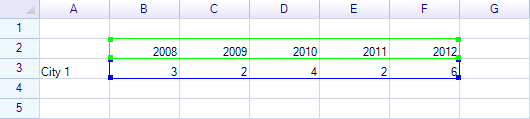
Result:
Customization
Slice Colors
chart.DataSerialStyles[0].FillColor = Graphics.SolidColor.SteelBlue;
chart.DataSerialStyles[1].FillColor = Graphics.SolidColor.Coral;
chart.DataSerialStyles[2].FillColor = Graphics.SolidColor.MediumSeaGreen;
Related Topics
- Chart Overview — Chart base properties and data sources
- Doughnut Chart — Doughnut variant