The DropdownListCell is a built-in cell body that displays a drop-down list for single item selection. It extends DropdownCell, inheriting the drop-down panel infrastructure.
Namespace
using unvell.ReoGrid.CellTypes;Create a Drop-down List Cell
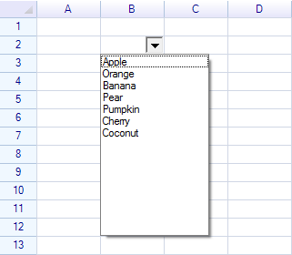
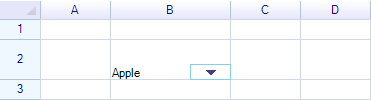
var sheet = grid.CurrentWorksheet;

var dropdown = new DropdownListCell(
    "Apple", "Orange", "Banana", "Pear",
    "Pumpkin", "Cherry", "Coconut"
);

sheet["B2"] = dropdown;
Result:
Constructors
| Constructor | Description |
|---|---|
DropdownListCell() | Empty drop-down list |
DropdownListCell(params string[] candidates) | Create with string items |
DropdownListCell(IEnumerable<string> candidates) | Create with a collection |
DropdownListCell(CellValueListSource source) | Create from a cell value list source |
DropdownListCell(ReferenceRange refRange) | Create using a cell range as the data source |
Using a Cell Range as Data Source
You can bind the drop-down list to a range of cells so the items update automatically:
// Items come from cells A1:A10
var dropdown = new DropdownListCell(sheet.Ranges["A1:A10"]);
sheet["C1"] = dropdown;
Using a Mutable List
Pass a List<string> to keep the items in sync:
var items = new List<string> { "Alpha", "Beta", "Gamma" };
var dropdown = new DropdownListCell(items);
sheet["B2"] = dropdown;

// Add items later — they appear in the dropdown
items.Add("Delta");
Properties
DropdownListCell Properties
| Property | Type | Description |
|---|---|---|
SelectedItem | object | The currently selected item |
SelectedIndex | int | Index of the selected item |
Inherited from DropdownCell
| Property | Type | Default | Description |
|---|---|---|---|
PullDownOnClick | bool | false | Open drop-down when cell is clicked (not just the button) |
DropdownButtonSize | RGSize | 16x16 | Size of the drop-down button |
DropdownButtonAutoHeight | bool | true | Auto-adjust button height to match cell |
IsDropdown | bool | — | Whether the drop-down panel is currently open (read-only) |
DropdownPanelHeight | int | 200 | Height of the drop-down panel in pixels |
MinimumDropdownWidth | int | 40 | Minimum width of the drop-down panel |
MaximumDropdownWidth | int | 1200 | Maximum width of the drop-down panel |
DropdownControl | Control | — | The platform control displayed in the panel |
DropdownButtonStyle | DropdownCellStyle | — | Visual style of the drop-down button |
DropdownCellStyle Properties
| Property | Type | Description |
|---|---|---|
ArrowNormalColor | SolidColor? | Arrow color (uses worksheet text color if null) |
ArrowDisableColor | SolidColor? | Arrow color when disabled |
Events
| Event | Description |
|---|---|
SelectedItemChanged | Raised when the selected item changes |
DropdownOpened | Raised when the drop-down panel opens (inherited) |
DropdownClosed | Raised when the drop-down panel closes (inherited) |
dropdown.SelectedItemChanged += (s, e) =>
{
    Console.WriteLine("Selected: " + dropdown.SelectedItem);
};
Since the drop-down list cell updates the cell data after an item is selected, the worksheet CellDataChanged event also fires:
sheet.CellDataChanged += (s, e) =>
{
    if (e.Cell.Position == new CellPosition("B2"))
    {
        Console.WriteLine("Selected: " + e.Cell.Data);
    }
};
Methods
| Method | Description |
|---|---|
PushDown(bool forceCellEdit = true) | Programmatically open the drop-down panel |
PullUp() | Close the drop-down panel |
Clone() | Create a copy of this cell body |
// Open the dropdown programmatically
dropdown.PushDown();

// Close it
dropdown.PullUp();
Set Default Data
To set a default value or change the cell data:
sheet["B2"] = "Apple";Result:
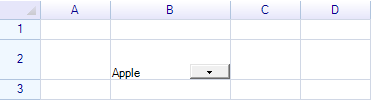
Change Drop-down Cell Size
Change Column Width
sheet.ColumnHeaders["B"].Width = 120;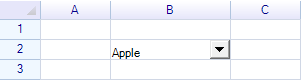
Change Row Height
sheet.RowHeaders[1].Height = 40;
Merge Cells
sheet.MergeRange("B2:C2");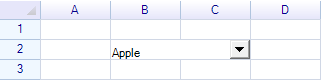
Set Padding Style
Shrink the drop-down control within the cell:
sheet.Cells["B2"].Style.Padding = new Padding(0, 0, 10, 0);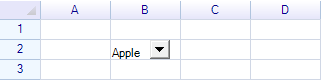
Change Drop-down Button Size
dropdown.DropdownButtonAutoHeight = false;
dropdown.DropdownButtonSize = new System.Drawing.Size(40, 15);
When DropdownButtonAutoHeight is true (default), the button stretches to fill the cell height. Set to false to use a fixed size:
Set Cell Border
A drop-down cell does not show borders by default. Add borders explicitly:
sheet.Ranges["B2"].BorderOutside = BorderStyle.GraySolid;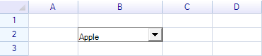
Open on Cell Click
By default, the dropdown opens only when the dropdown button is clicked. Set PullDownOnClick to open on any click within the cell:
dropdown.PullDownOnClick = true;WPF Styling
On WPF, customize the list appearance through the Style property:
#if WPF
dropdown.Style.TextColor = SolidColor.DarkBlue;
dropdown.Style.BackColor = SolidColor.LightYellow;
dropdown.Style.FontSize = 14;
dropdown.Style.FontWeight = FontWeights.Bold;
dropdown.Style.HorizontalAlignment = HorizontalAlignment.Left;
dropdown.Style.Padding = new PaddingValue(4, 4, 4, 4);
#endif
DropdownListStyle Properties (WPF Only)
| Property | Type | Description |
|---|---|---|
TextColor | SolidColor | Text color in the list |
BackColor | SolidColor | Background color |
Font | FontFamily | Font family |
FontWeight | FontWeight | Font weight |
FontSize | double | Font size |
FontStyle | FontStyle | Font style (italic, etc.) |
HorizontalAlignment | HorizontalAlignment | Item horizontal alignment |
VerticalAlignment | VerticalAlignment | Item vertical alignment |
Padding | PaddingValue | Item padding |
Reset() | method | Reset to default style |
CopyFrom(style) | method | Copy from another style |
Draw a Custom Drop-down Button
Override OnPaintDropdownButton to customize the button appearance:
class MyDropdownListCell : DropdownListCell
{
    public MyDropdownListCell(params string[] items) : base(items) { }

    protected override void OnPaintDropdownButton(CellDrawingContext dc, Graphics.Rectangle buttonRect)
    {
        dc.Graphics.DrawAndFillRectangle(buttonRect, SolidColor.DeepSkyBlue, new SolidColor("#BEE7F1"));

        var centerPoint = new Graphics.Point(buttonRect.Left + buttonRect.Width / 2,
            buttonRect.Top + buttonRect.Height / 2);

        GraphicsToolkit.FillTriangle(dc.Graphics.PlatformGraphics, 9,
            centerPoint, GraphicsToolkit.TriangleDirection.Down,
            this.IsDropdown ? Pens.SkyBlue : Pens.DarkSlateBlue);
    }
}
Make a Custom Drop-down Cell
Create custom drop-down cells that place any control inside the panel by extending DropdownCell:
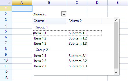
See How to Create a Custom Drop-down Cell.
Class Hierarchy
CellBody
  └─ DropdownCell (base — panel, button, open/close)
       └─ DropdownListBaseCell (candidate source)
            ├─ DropdownListCell (selection-only list)
            └─ ComboListCell (editable combo with auto-complete)
Related Topics
- Built-in Cell Types — All cell type overview
- Combo List Cell — Editable combo box variant
- Custom Cell — Creating custom cell bodies
- How to Create Custom Drop-down Cell — Custom drop-down tutorial